Donate to Keep Electric Literature Free!
Electric Literature published over 500 writers and nearly 600 articles in 2023—all of which are free for you to read. EL’s archives of thousands of essays, stories, poems, and reading lists are also free. We need you to contribute to keep it that way. Please make a donation to our year end campaign today.
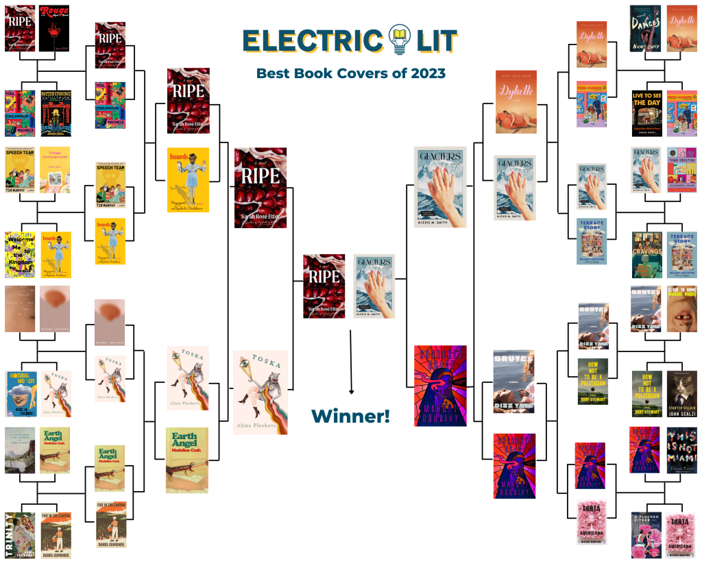
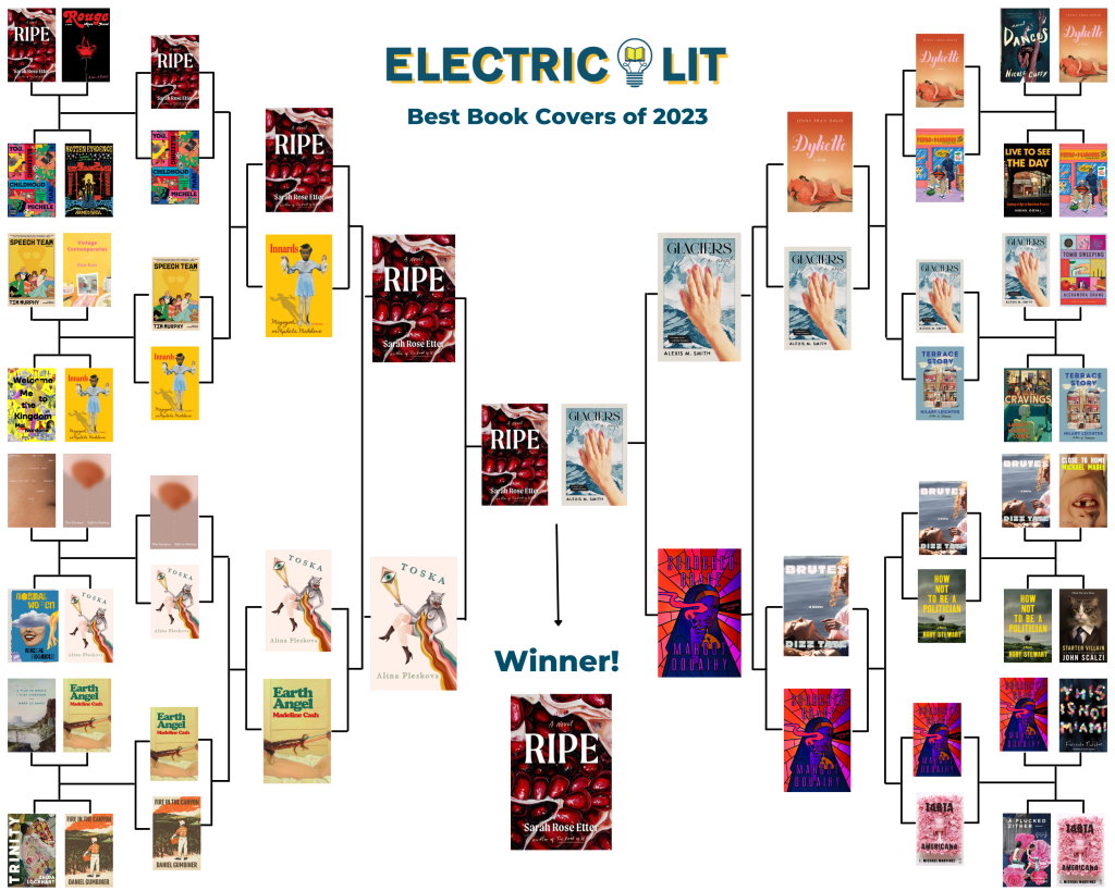
Last week, we asked our social media followers to vote for the cover of year from the best 32 designs of the year. This year’s tournament was fierce, with surprise twists and crowd favorites that bowed out early. The winner edged out the competition by a mere 6 votes.
From 32 cover designs, here are the semi-finalists:
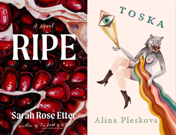
Ripe by Sarah Rose Etter, illustration by Angela Faustina, design by Natalia Olbinski Heringa, vs. Toska by Alina Pleskova, art by Katy Horan
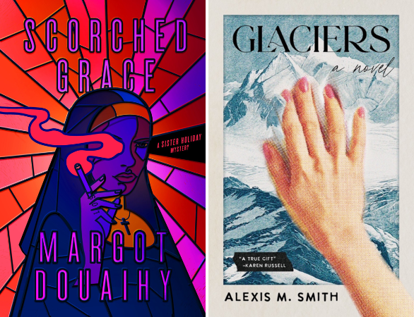
Scorched Grace by Margot Douaihy, design by Will Staehle, art direction by Evan Gaffney, vs. Glaciers by Alexis M. Smith, design by Beth Steidle
From the Final Four, now we’re down to two crowd favorites:
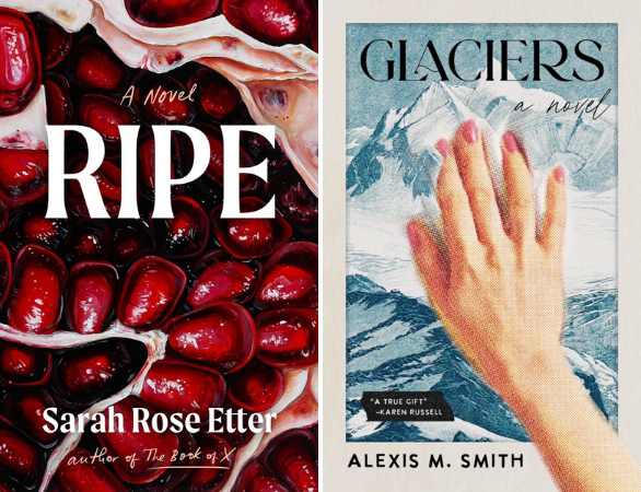
We spoke to the author of Ripe and the designers of Glaciers about creating their book covers:
Electric Literature: Tell us about your design process for this book cover and what you wanted to convey through the artwork?
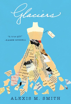
Beth Steidle: The first edition of Glaciers, by Alexis M. Smith, was published in 2012. It was very well received, and the cover was well loved. Tin House wanted to celebrate this book and introduce it to a new audience with a reissue approximately 10 years later. The biggest challenge was to come up with a new package that still retained many of the successful elements of the first package (left): a vintage sentiment, elements of collage, a lightness, and femininity. However, for the new edition, we also wanted to visually highlight the overarching environmental concern and shifting landscapes that factor into the book, an element of the narrative that is so critical to our current national conversation. The most beautiful moment in this book, for me, is when the protagonist reaches out to touch a glacier, so that is the moment I focused on for this design.
EL: Did you have any interesting false starts or rejected drafts you can share with us or tell us about?
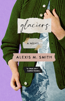
BS: This cover was not the cover that was originally approved. The first cover featured a vintage illustration of a woman wearing a green cardigan and sheath dress. The mountains and glaciers were superimposed over the woman’s dress. We loved that cover but there were concerns that the green cardigan could be construed as too old fashioned, so we opted for the more surreal design. It felt smarter and timeless.
EL: What’s your favorite book cover of 2023, besides your own?
BS: 2023 was a fantastic year for book covers. Ripe and Tomb Sweeping are both favorites of mine but, ultimately, Paul Sahre’s cover design for the paperback edition of The Employees by Olga Ravn, wins my vote for best cover of 2023. It’s such a creepy, compelling image, perfectly paired with that minimalist white background and off-kilter type. It tells you everything you need to know and also not nearly enough, which is what the best book covers should endeavor to do.
Sarah Rose Etter, author of Ripe:
Electric Literature: As an author, what was the book cover process like for you?
Sarah Rose Etter: With any book, at least for me, we have a few rounds of cover ideas because I’m picky about a cover. I always tell the publisher that up front—I just love visual art so much that it matters to me a lot.
During the pandemic, while I was writing Ripe, I was just deep in my pomegranate research—I was searching films, art archives, anything I could get my hands on. Angela Faustina’s art popped up and became something I returned to over and over again while I was drafting the book. At one point, I was recreating her paintings myself in between drafts, mimicking her style.
Scribner asked me to send over a bunch of art that had inspired me while drafting—and of course, Angela’s work was at the top of the list. When the cover options were sent over, this cover jumped out and I was floored—it hadn’t occurred to me that Angela’s work would end up on the cover. But now it feels like kismet in a way—I got incredibly lucky with this cover.
EL: What are your thoughts on the cover and how the artwork ties in with your book?
SRE: Angela’s work is so visceral and unexpected. Her pomegranates make you look twice—the painting feels like it could be part of the human body or the brain, but it’s still beautiful. Since the last section of the book specifically is about seeds and the interior of the body, her work just fit perfectly as almost a foreshadowing of what is to come,
I think, too, sometimes you need a great title for a perfect cover—we were going back and forth with title options for the book, and once we hit on Ripe as a title, we really needed a juicy, glistening cover and Angela’s work was a perfect fit for that, too. The title and the font both work so well with the art—it just all came together. When Jaya [Miceli] and Natalia [Olbinski] sent this cover over, everyone got really excited—you felt that buzz of “Oh yes, that’s it!” The team at Scribner worked really hard to nail this cover so I’m really grateful to them.
EL: What’s your favorite book cover of 2023, besides your own?
SRE: I honestly really love the cover for Glaciers—it’s bold, unexpected, always makes me look twice so that’s tough competition! I also love the new McNally editions covers. But this is an impossible question for me, especially with the number of art books I buy. Every Sophie Calle cover is incredible. I also saw there was a crazy galley going around in the UK where the entire book was hardcover and holographic with no title on the front—it was beautiful, but now I can’t remember the title of the book so I guess those wild artistic choices can backfire. It’s still a gorgeous book.
The winner of Electric Lit’s 2023 Book Cover Tournament: Ripe by Sarah Rose Etter, illustration by Angela Faustina, design by Natalia Olbinski Heringa.

